It all started with a master Sketch file. A single file with 5 projects inside (one for each area of the Bonfire website). Things were perfect, until… they weren't.
 How it felt to wait for a Sketch file to load
It was taking longer and longer to open up the file. As features grew, the loading time became unbearably slow.
No problem, we said — let's make a file for each component of the Bonfire platform. The account dashboard, internal tools, t-shirt design tool, and all the other areas of the app each got their own home.
This worked well for another year, until I started to get lost inside my own Sketch files. Each file had tens of pages with hundreds of artboards inside (well over a thousand artboards altogether). After realizing that sometimes it takes longer to find the right file than do actually complete a task, it was obvious that something had to change.
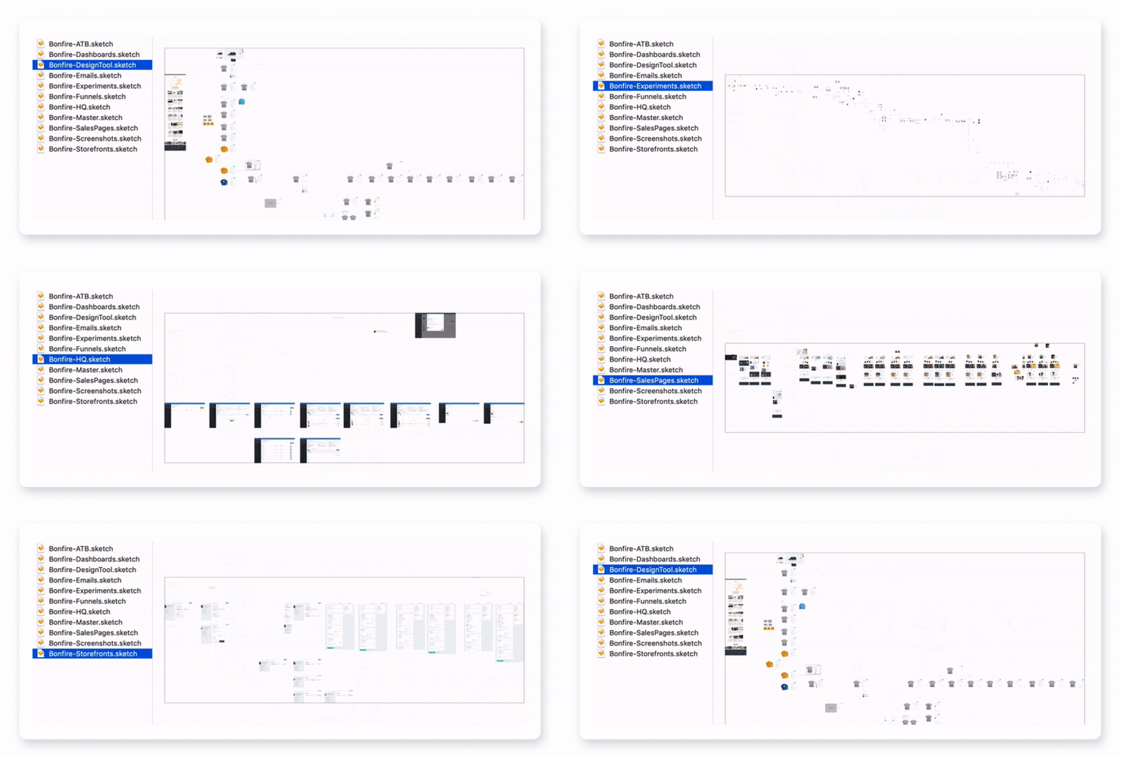 The Bonfire product design system (circa early 2019)
The idea of Figma has been floating around the Bonfire product team for years. Back in 2016, when it was first released, the prospect of collaborating on memes seemed really exciting. However, we didn't seriously consider it for the product design process, mostly because it was so new, and the existing process worked just fine.
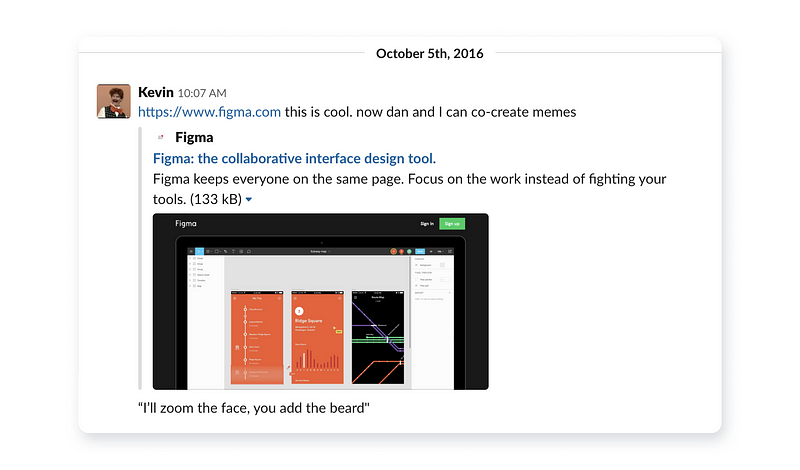 The primary Figma use case that we discovered in 2016
Three years later, we finally decided to give it a try. After a transitional period of about a month, it turned out to be quite successful.
A new start
Even though Figma has a neat auto-import feature for Sketch files, this seemed like a great opportunity to redraw all of the UI from scratch (based mostly on the screenshots from the live website). It may sound tedious, but it actually didn't take long at all. One of the benefits of this was to get all of the components up to date with how they actually looked & worked in our Angular app.
My goal was to spend as little time on managing & organizing the design system as possible, thus freeing up more time for experimenting. As Florent Crivello writes in The Efficiency-Destroying Magic of Tidying Up, efficiency tends to look messy, and good looks tend to be inefficient. It's important not to be caught up in spending hours or days on polishing the internal design system (that practically no one is going to see). This allows to allocate more free time to tinkering with new ideas & refining the actual product that needs to be shipped.
A simpler software stack
We previously used InVision and Google Gallery for mockup sharing, Principle for animation and Google Drive for asset storage. Using Figma for handoff allowed us to eliminate (almost) all of these services. Getting rid of the need to export static screenshots just for internal feedback processes really sped up the process of design iteration as well.
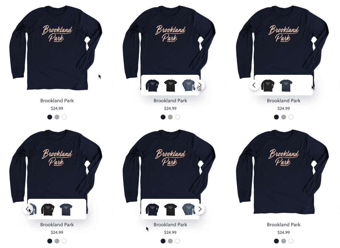 A simple micro-interaction that would've required 3 separate tools to create
Built-in prototyping (with GIFs)
My favorite thing about Figma is the native prototyping functionality. Being able to use GIFs for loaders is an extra bonus that really makes the prototypes feel like the real deal. Smart Animate is a relatively new Figma feature that is also a game changer when it comes to prototyping micro-interactions, since it allows to create seamless transitions that can be easily replicated in code.
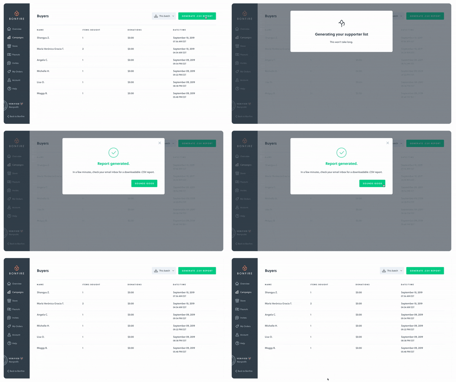 Even a simple loader icon can make a prototype feel real
The cloud
It's liberating to not have to think about file structure, or sharing files between multiple computers. The only downside of using more cloud-based services like Figma is that I actually keep forgetting to save work in other, non-cloud apps since I'm so used to auto-save.
Organization system
Since every team is different, there's no right or wrong way to organize design files. By analyzing other teams' design organization, I noticed a few common patterns and tried to implement them in the Bonfire system where appropriate.
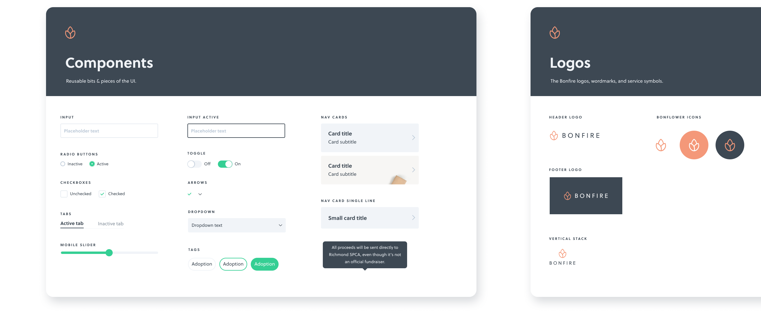 The master shared design library
Projects
The projects are organized alphabetically, with the exception of the Design System library. Those styles are shared by all editors across multiple departments.
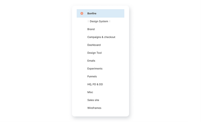 The global project structure
Cards
We use a customizable card component to quickly generate a thumbnail for each Figma project. This way, PMs, designers & developers can easily find the right file and see the "ready for development" status at a glance.
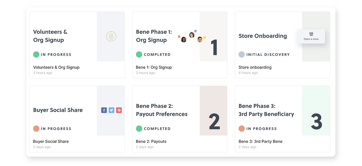 Custom card thumbnails for each project
Brand, marketing & product design files can all live in one place — no need to worry about duplicated icons, or missing logo files. The era of "hey, can you send me that Sketch file" is finally in the past.
*well, for the most part. Parting with familiar design tools can take some time.
Pages
We usually dedicate a page to each part of a project. All the pages that are ready for the developers get a number assignment and a checkmark emoji. Initial flows/explorations usually go after that, often helpful to explain or present the mockups & reasoning behind certain decisions to stakeholders. The archive page usually hosts all the miscellaneous bits that never make it to production. Those can be quite useful when looking back at older projects and iterating on features.
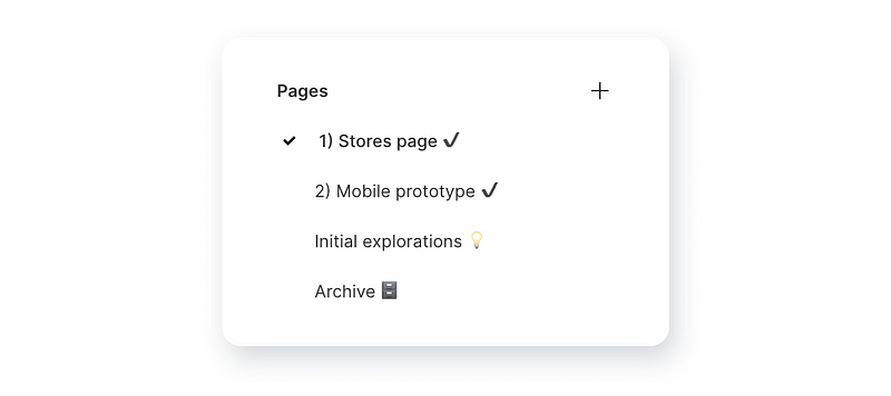 A typical page structure for a project
While Figma is overall a vast improvement over most design tools out there, there are some aspects of it that could definitely be improved.
What's not so hot about Figma
The flat user interface
The Figma user interface is, sadly, just not quite as pleasant as Sketch's. Embracing the flat aesthetic, which does a good job of not distracting from the canvas, makes it hard to tell some of the controls apart. Adding some skeuomorphic depth to the buttons & other UI elements could really make an impactful difference.
Comments
It's easy to get lost in long comment discussion threads. Sometimes it's hard to tell at a glance which comments are addressed to you, especially when many stakeholders have different "mention" etiquettes. With some comments left in prototype mode, and some in the regular mode, it's easy to lose track of discussion.
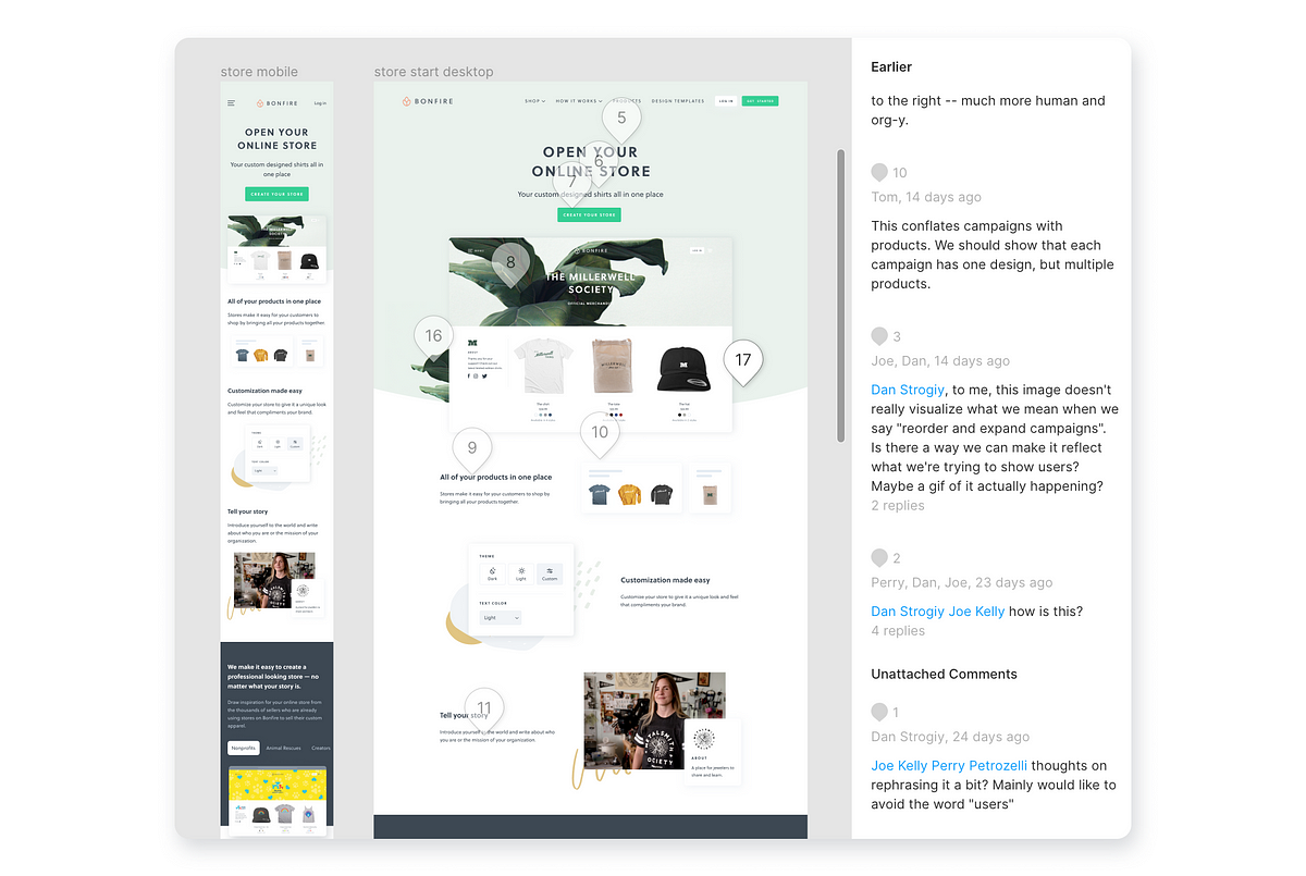 Sometimes it's hard to find the exact comment you're looking for
Layers + Assets
After selecting an icon from the asset library, you have to click back to the Layers panel to keep working with the file structure. The extra clicks really add up and slow down the process.
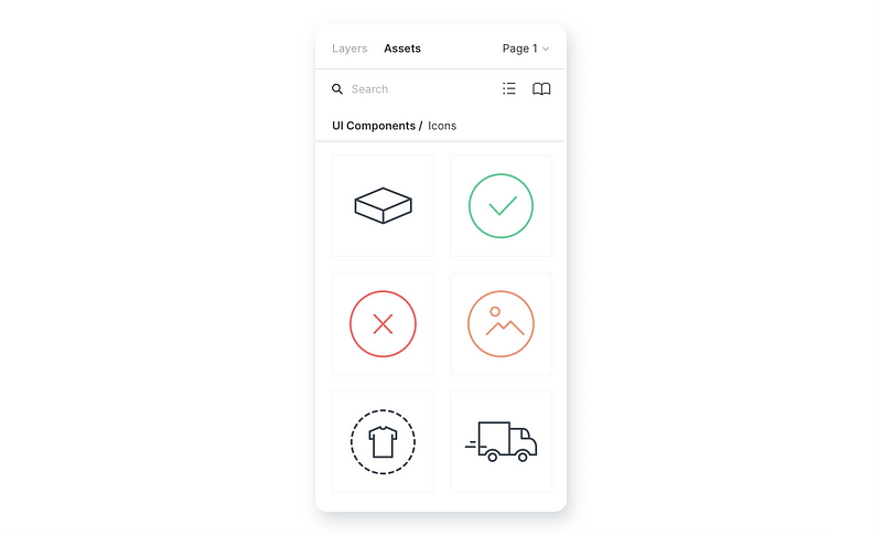 The Layers / Assets switch panel
Overall, these quirks are pretty minimal and don't have much detriment to the everyday design process. I have high hopes in the Figma folks improving them soon.
The Future of Digital Design Tools
Figma seems like the design tool of choice for digital product design teams in 2019. It makes it super easy to create low & high fidelity flows, collaborate, prototype, and iterate, all within a single app. Most importantly, it's super fast (and speed really matters).
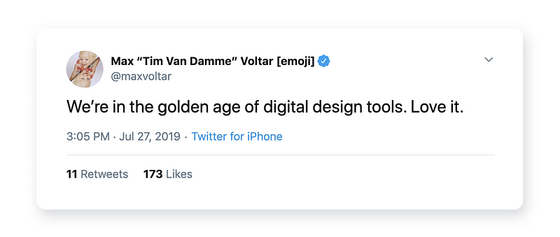 To quote Tim Van Damme, we live in the golden age of digital design tools.
It's exciting to see what the future holds for the digital design industry. Design tools like Modulz blur the lines between front-end development and design even further. Both Sketch & Framer are actively working on cloud collaboration features as well. The more efficient these tools get, the more time designers can actually dedicate to solving the right problems (and create memes in the down time).
Disclaimer: I was not paid or sponsored by Figma to write this.