It's been a little over a year since we originally released Bonfire. The past month has been especially exciting for me personally, since we shipped several big features along with bunch of smaller platform improvements. Here's what we've been up to:
-
Refreshed our brand identity and website
-
Updated the design tool & setup flows
-
Launched Supply — an easy way to order custom shirts
Keep reading to learn a bit more about these, as well as to see how our brand & product design system evolved over time.
A growing brand
Over the past year and a half, our design & brand identity system has matured. As the company grew, the brand system evolved with it. Some components stayed the same, while others have been gradually phased out.
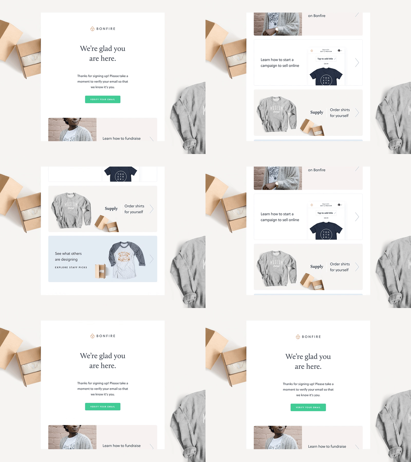 New welcome email
One exciting addition to our brand family is Calluna — a serif typeface used in welcome emails, packaging, and other places where we need to appear friendly, yet premium. It pairs well with Soleil , used everywhere else in the Bonfire universe.
 A snapshot from the type specimen
When it comes to projects that are not directly related to our core product, it's always ok to step away for a bit and have some fun.
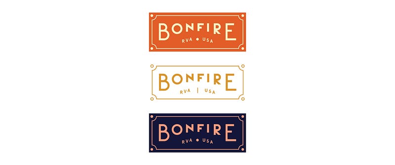 Badges made for some internal swag
Design systems and anti-fragility
Just like the brand, our product design system has continued to evolve. Once the main components were designed and in place, the visuals started to play less of a valuable role. It became way more important to figure out how to make it work together, while still being able to consistently iterate.
I like to draw parallels between design systems and principles of anti-fragility coined by Nassim Taleb. When a team depends too much on a rigid design system, it becomes fragile. The more strict guidelines and nested components it might have, the harder it gets to iterate and break out of the system once in a while.
 Bonfire design system at work
For a mid-size startup like Bonfire, a less rigid and more fluid design system is something that I've found works best. It's important to have to have a master Sketch file, but it's even more crucial to have many secondary ones, filled with experiments. It's a natural process of keeping things that work, and discarding components that are no longer needed. Sometimes a little mess is beneficial.
Updated website
This week we rolled out a new version of the Bonfire website.
We considered a few different design variations for the new homepage, but none seemed quite right — until our CMO suggested to take a look at Bonfire's past. The original Bonfire Funds site from a few years ago featured a grid of people proudly wearing their new custom shirts. We decided to take a similar approach for the new design, but highlight the portraits even more, focusing on how custom shirts can help bring communities together.
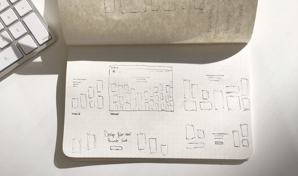 Figuring out the right layout
Building the grid of portraits turned out to be a small technical challenge of its own. The team agreed that it would be a nice touch to add an animation to bring these images to life. In a time crunch, we had to choose between several options to design and animate the hero:
-
Load just one big image and call it a day
-
Build & animate individual tiles (that's 43 simultaneous http requests)
-
Use just one image, but render tiles via sprites
A few prototypes later, and a couple of hours of back and forth with the world's most polite front end dev team, we decided to go with just one image (exported and loaded at different screen densities) + a linear CSS gradient mask with a brief delay to add a light animation.
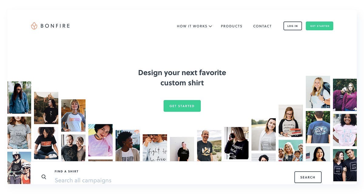 New Bonfire homepage
Besides the homepage, we updated the global navigation and revamped the How it Works section to highlight our core products better.
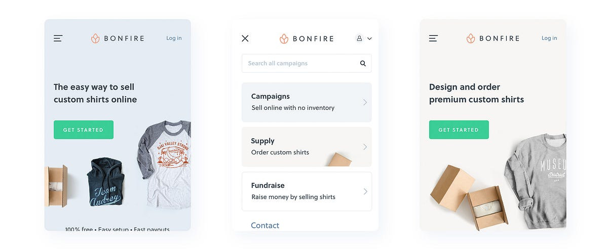 New, simplified global navigation
Design Tool
Last month we shipped the first iteration of our new design tool. The new version, while keeping most of the same functionality as the old tool, was redesigned to match the rest of the brand. We removed unnecessary clutter and made frequently used features even more accessible.
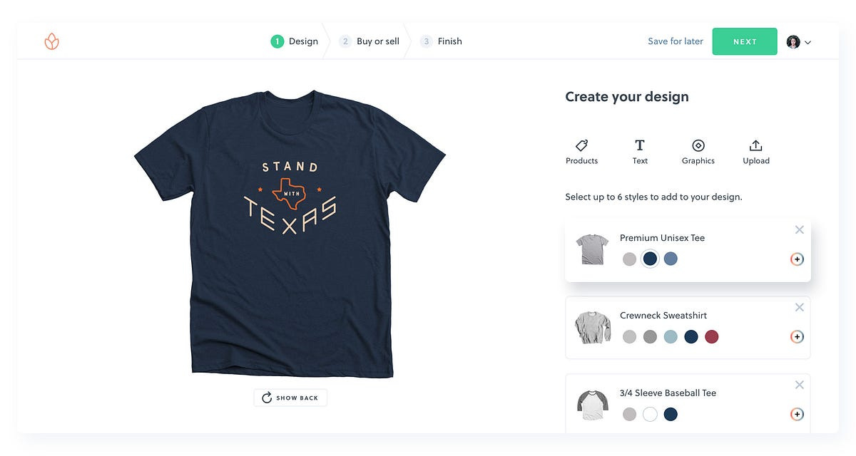 Our new design tool
This project was a perfect example of how strict technical constraints influenced the design process. We didn't change the technology behind the canvas rendering, so we had to carefully work around it instead (and make the whole thing responsive too).
 Updated icon system for the transform tools
Building a prototype early in the process was one of the most important steps that we've taken. After doing a few rounds of in-person user testing, the things that we needed to change became quite clear. In one of the variations, we were testing a fixed bottom toolbar. We found out the people seemed to miss most of the controls in there, so we opted in to keep all the functions in the sidebar that made its way to the final release.
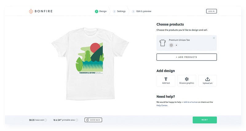 An early prototype we built for testing. People had a really hard time finding that "Show Back" button
Another thing we found out during user testing was that almost no one could figure out how to add extra shirt colors to the design. We had to add some color to the add button in order to fix that.
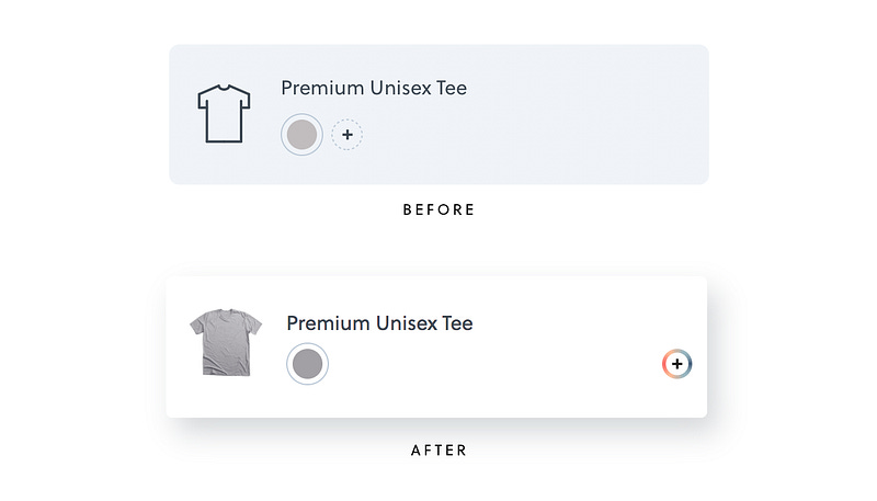 Current, but definitely not the final version of the product card
Of course, as with every new feature, the things in need of improvement became even more obvious right after the release. Better onboarding, improved text and graphic editing, design templates and many other cool things are all in the works.
Supply by Bonfire
Supply is a new and exciting paradigm for Bonfire and a step away from our traditional campaign setup. One the most requested features was an ability to order shirts on demand, so that's why we built it.
 Supply brand identity
Visually, we decided to differentiate the Supply brand from campaigns by adding a new signature color to our brand system, along with a serif word mark. Unlike other print-on-demand platforms, we offer a carefully selected limited collection of products, so we wanted to make sure the brand identity reflected that. Ordering through Supply is easy and is similar to setting up a campaign.
What's next?
Deciding what to build next is never easy. Every new feature that we release is directly proportionate to the amount of time spent maintaining it. I find the Broken Windows Theory always applicable to user interface systems (both design and code). If no one pays attention to the UI library or the code base, things get messy real quick, and the only way to fix them is to refactor the whole application.
As a designer, I'm naturally biased towards wanting to build new things, so it's important to have a product manager around who can set the priorities straight. Sometimes we have to ask ourselves: do we really need to build this?
 PM using a happy emoji — a very suspicious sign
As we continue to grow the platform, it's important to stay true to Bonfire's core values, yet still to be able to break out of the box once in a while. When design processes fully align with the company's objectives, everybody wins.